
One of the amazing things about working with NorLights Press is that they actually want my input on my cover design. They asked me to send a collection of covers I like in order to have an idea of what direction to take mine.
I thought I'd share this process with you in case you're interested. So today I'm going to share what I showed them, and why I like what I like.
Interestingly enough, I didn't actually know what I liked. I could name book covers I was drawn to, but if you asked what basic designs appealed to me, I would have shrugged my shoulders. Once I started assembling a list, though, there were some VERY clear patterns!
Here is one. can you see the common theme?
Big skies. Simple landscapes that evoke a definite mood. Clean, simple lines. Uncluttered. Neutral palates with a color or two on the bottom that really pops, but in a smallish way.
Okay ; on to the next.
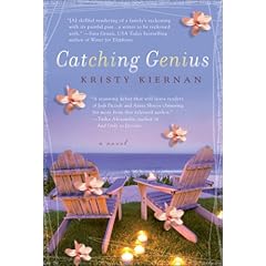
These are Emily Giffin novels. I love the simplicity of them. There are, I think, four like this, but I chose the two that I like the best. The colors are soft but eye-catching, and the tiny pictures symbolize the theme of the story. I think I could do this with mine if I continue the series as I hope to do.
The next one I picked from my own memory randomly but once I had them lined up, obviously show a pattern on my part!

There is something I love about the black background with that one bright thing that pops on the cover. It's just very eye-catching to me. And Kim's book? Well, it's a double whammy with that blue. I love blue. I am very drawn to books with blue, turquoise and purples for some reason. Give me a table full of books and I will immediately pick up the one that looks like it just walked out of the Caribbean Sea.
See what I mean?
And that Blue Notebook one? I could totally steal that. I really, really love it.
And if you add an ocean to it... I'm all over that one!
Aren't the soft colors and clean lines in that one just gorgeous? So sad I didn't write this book about an ocean town. My first novel - the one under the bed - is about an ocean town. I may have to go back and dig that one out just so I can do a cover design for it!
This one is my favorite. The colors, the use of light, the magical quality it evokes. I think it's possible I just really wish I were there.
I'm not a fan of collages usually, but I think they can be done well. Here is one I really like.

I like the colors, and the monochromatic theme makes it feel less busy than most collages. The faces are beautiful too: evocative and yet simple.
I decided I like simple.
The next two I actually bought in a bookstore just because I passed them and saw the covers and thought, WOW! I love this! (Of course the story looked good, too.)
I like the ocean, of course, but I really like the painting feel of the cover, and the fact that no faces are shown (so I can imagine the characters, which is what I'd rather do than have a photo of someone on the front that conflicts with the picture in my mind).
But I like the relationships in the pictures as well. There is an intimacy alluded to, and in that intimacy there is an unspoken crisis.
So those are some of my favorites, and why. They are going to do a few different mock-ups so I can look at them, decide what I like from those, and then we can tweak the one I like best. I'll let you know as it happens so you can go along with me on the ride.
As for you: tell me what book covers are your favorites, and what are you immediately drawn to?
You put up so many great examples it's hard to choose. I love the body finder and the blue notebook.
ReplyDeleteCan't wait to see what your cover will look like.
I like the the simple covers best. Of course the cover I've imagined up in my mind for my book is anything but simple. However, I think all of the covers you chose are great-ones I would definitely stop for as I passed it in the bookstore. I'm very excited to see what yours will look like.
ReplyDeleteI agree with Patti and Jessie... there are so many good examples here, I'm finding it hard to choose. I like simple covers, with perhaps one significant image. That's how I imagine mine - and that was one of the strengths of the TWILIGHT series... simple black with one indelible image.
ReplyDeleteThe COLUMBINE cover is especially effective... can't wait to see what your publisher comes up with! Good luck!
I love the first three, because that 2/3 rule is very strong, and of course, that big sky. It can work for so many different atmospheres.
ReplyDelete(Don't your characters live out in the country? I can see their house on the horizon... maybe a bus on its way...)
I have ideas for mine too and I hope some day I get to suggest them. I think it's so cool that you get input. Again, there's the small press advantage!!
And may I say, AGAIN that this is such a huge buzz!
Also... I judge books by their covers.
ReplyDeleteThere, I said it!!
Duh! I'm not a very good writer! I meant to say, tell me what your favorite covers are from books you like... not necessarily these! :)
ReplyDeleteLaura - I actually included the Twilight series in my email to NorLights. It fits so well with those black ones. I love the idea - I'm just having trouble figuring out what one image I would use.
Heidi - photographically speaking, I'm very drawn to the 2/3 rule too (I think Columbine is almost a 1/5 rule, which is maybe why it is so strong. And i like that the title is so subtle, which the Cape one is not... I don't like the title on that one).
i actually tried some mock-ups of my own to send to them with that idea - a small country road through the blue bonnets with that big, blue sky. Mine wasn't very good because I didn't have a decent set of photos to work off, but I still really like the idea and told them about it. We'll see if they do one like that.
It IS a buzz, isn't it? I keep pinching myself. I'm so glad it's making you excited too!
I love reading this stuff on other blogs... this idea that dreams really do come true for some people. So why not you?
Its very exciting, I agree! And I like the covers you've picked as examples...can't wait to see the cover!!
ReplyDeleteThat's awesome and rare that you get input into your cover.
ReplyDeleteI'm drawn to the ones with photographs like the first couple you show.
You've picked great covers...simple and eye-catching. I can't wait to see what you (and your publisher) come up with!!! :)
ReplyDeleteI like them simple b/c w/ all the distractions in a bookstore, the simples ones *pop*. And I always think if a book is really well-written, they don't need all the flash and pizazz of an over the top book cover.
ReplyDeleteYou, my friend, only need simple =)